

Today is probably the most important day in our short history. Today we present our new dashboard, a huge step forward in line with our vision of the future of enterprise mobility management.
We have never been so proud of any other tool or functionality that we have deployed before and we are sure that it will become a game changer in the market.

Some background
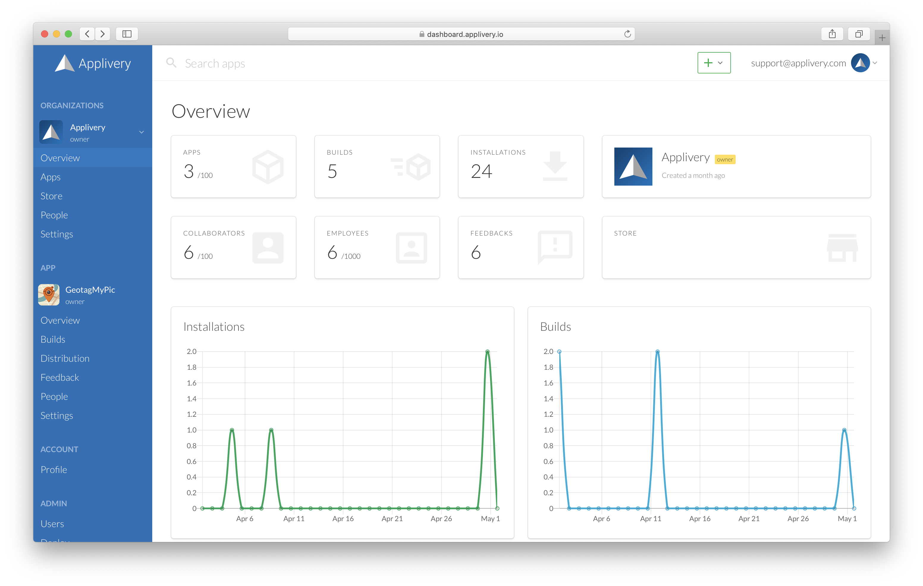
Back in June 2019 when we released the previous version of the dashboard along with numerous improvements at the App Store and distribution level. However, that version was only a technological improvement that did not involve major changes at the visual level.
It was during 2020 that we decided to enter the exciting world of mobile device management. This new direction required something much more than a simple technological upgrade and that was when we began to plan what has become a reality today.
In early February 2021 we launched Applivery Device Management with limited support for Android devices. A few months later we began piloting support for iOS and it was just a few weeks later when we realized that Applivery’s main work tool, the dashboard, was not enough to satisfy the new needs of our users. Optimizing its usability, simplifying adoption and maximizing user productivity became key aspects of the success of our platform.

We got down to work and started working with our usability and product experts to design what the future of enterprise mobility management should be, putting the user at the center and focusing on simplifying the most common processes, making IT asset management a less arduous task.
Last February 7th we launched our bold new brand. 5 months later we are proud to announce the launch of the new Applivery dashboard that reflects our new look & feel at its best, and also represents a major quantitative leap in terms of usability and user experience.
What's new?
But let’s get to the important stuff and delve a little deeper into what news and improvements we can expect from the new dashboard. We will divide them into 3 groups:
- Visual & navigation improvements
- Functional improvements
- Usability improvements
Visual & navigation improvements
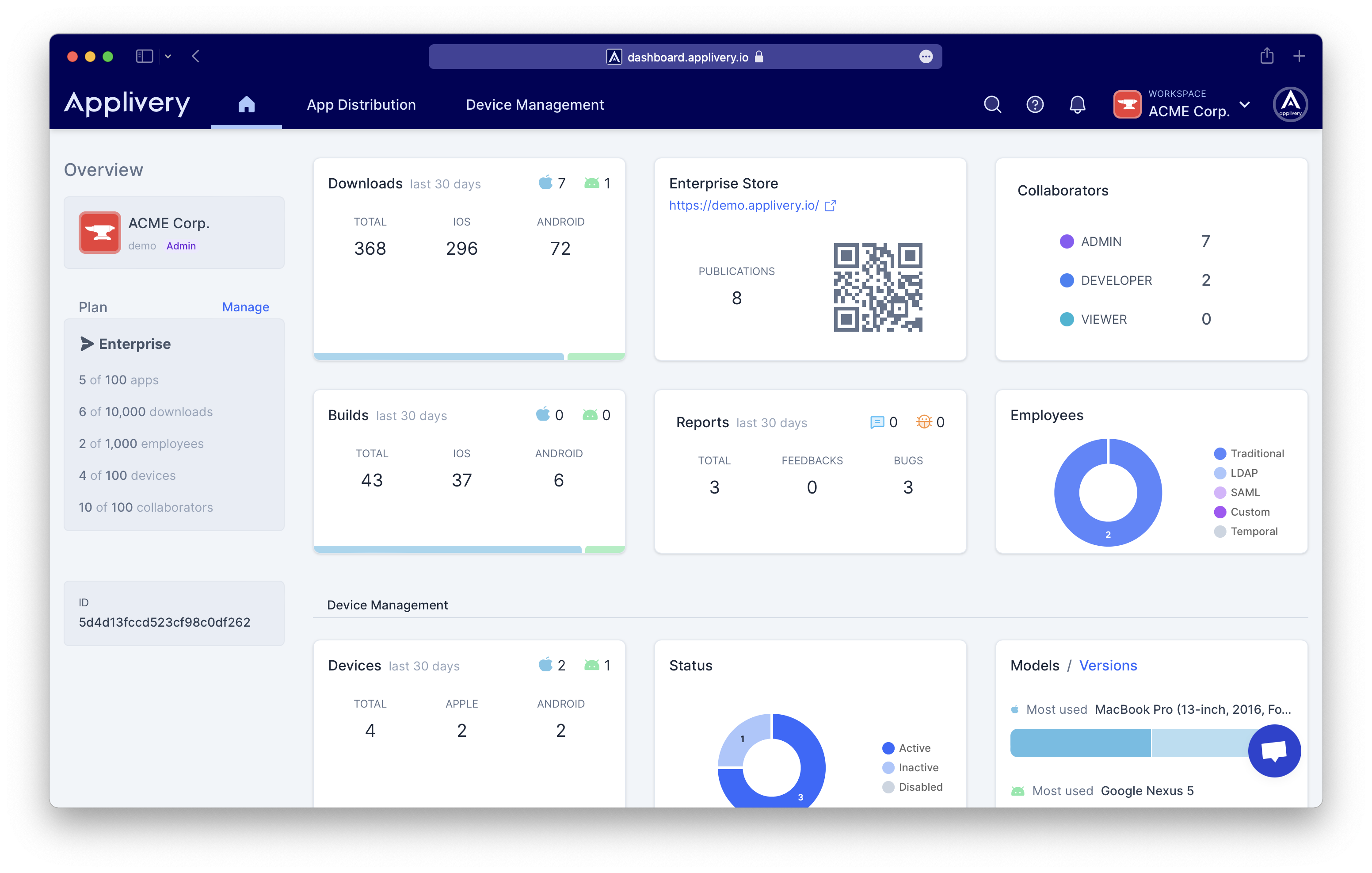
In the first place we have tried to represent our new brand in all aspects of the dashboard, not only in the color palette but also in each single element: fonts, iconography, menus, blocks, sections, charts…
The most representative change is the new upper navigation bar that concentrates the vast majority of the menus and actions, divided in 3 main sections:
- Home
- App Distribution
- Device Management

We have taken the opportunity to introduce the concept of Workspaces (previously known as Organizations). All the functions related to our workspaces are now centralized in the right-top drop-down menu. Right next to it we find the profile dropdown menu.
We have completely removed with the side menus, thus offering more horizontal space to incorporate contextual information about what you are seeing at any given moment.
App Distribution and Device Management each have a horizontal sub-menu that will allow you to navigate between the different sections of each product.
Additionally, we have given more relevance to the two most important elements: Apps and Devices. Each of them now have a dedicated view with its own top navigation menu:


Functional improvements
There are many new features that have been included in this new version. Here we tell you the most important:
New global search feature:
A brand new global search feature that allows searching across Apps, Builds, Devices and Policies across all your organizations. You can trigger it from the magnifier icon at the top or just using the shortcuts: Control + K (in PC) or Command + K (in Apple).

Device Management analytics:
You can now explore the main insights of your Android and Apple devices directly from the Home of the dashboard. You might find specially useful the new charts for devices and versions distribution or the status of your deployment, that includes the number inactive devices (not reporting in the last 5 days).

Archive & mark as read feedback & bug reports:
Now you can be more productive while looking into bug and feedback reports from your team. You can now mark them as read but also archive them once fixed.

Track devices geolocation (only for Android so far)
Thanks to our new agent, you will be able to get access to the geolocation of your fleet of devices in real time. In addition, you can access your location history.

Usability improvements
Finally, we would like to highlight some usability improvements that we hope will provide a substantial help to the productivity of our users:
New table search and filtering options:
Advanced search and filtering options have been included in all tables so that you can search across all columns and apply filters in a more easy way. Additionally, searches and filters will be temporarely saved for a more convenience back and forth navigation.

Table navigation, ordering and pagination:
This has been also rebuilt from scratch. You can now choose the number of results per page and order for any column (only in Apps so far but soon will be available in all content tables). You can also jump to an specific page from the page selector at the bottom of the page and also use arrow navigation ↑↓ to move across pages.

Guided tutorials and tips for almost everything:
As commented throughout the post, we have put a lot of focus on simplifying the use of the platform, so now you will find numerous guided processes and tips that will help you better understand the different configuration actions and options that Applivery offers, with direct links to our documentation.

What's next?
We are very excited about this big step forward, but we don’t want to leave it here and that’s why in the next few days we will announce an upgraded version of Applivery Device Management for Apple devices with advanced features and full support for:
- iOS, macOS, tvOS, watchOS
- Apple DEP (Device Enrollment Program)
- Apple VPP (Volume Purchase Program)
and much more to come…